

See How Gerrymandering Screws Over Non-partisan American Voters in One Chart
The more a voting district leans ideologically, the more divisively their representative governs.
Updated Bridge Grades for the 119th Congress are live.
Gerrymandering is the egregious practice of drawing voting districts to ensure huge partisan advantages and guarantee victory. Both parties do it, and it’s arguably the most lethal reason our political representatives are more ideologically polarized than American voters themselves. The result of gerrymandering is uncompetitive primary elections, generally won by ideologues whose beliefs are even more rigid and inflexible than the people they represent.
Can we quantify gerrymandering’s contribution to polarization?
We also wanted to know so we turned to the data to see for ourselves. The headline is that excessive gerrymandering results in divisive zero-sum game politics—and American voters are the losers.
Let’s look at this chart more closely.
On the horizontal axis, we plot the absolute ideological lean of each voting district for the House of Representatives—the farther left, the more balanced the district, the farther right, the more ideological its base of voters. This partisan lean data comes from Cook Political Partisan Voting Index (PVI).
On the vertical axis, we plot Bridge Scores from the 118th Congress which ended in 2024. Bridge Scores are a measure of how collaborative (top of chart) or divisive (bottom of chart) a Congressperson governs by compiling public data about their rhetoric and legislative record. [A full explanation here with all of the data on Bridge Grades for Congress.]
The chart above plots all 435 members of the House of Representatives and shows the link between more collaborative governance coming from districts that are more ideologically balanced, and how those representing more ideologically extreme districts govern as dividers—secure in their power to get reelected.
As the chart caption indicates: The more balanced the Congressional district, the more collaborative their House representative governs (Bridge Score). The stronger the ideological lean of a district, the more divisive their representative behaves.
The thing about gerrymandering is that both parties love it. It’s maybe the one thing they can agree on.
Unfortunately, we as citizens pay the costs. Low collaboration in the House is bad for Americans as it means fewer common sense solutions and more zero-sum-game politics based on partisan tribal warfare—the country stays stuck in the slow lane, jammed up by infighting.
Takeaway
Gerrymandering is a hard problem that others are trying to solve, and we cheer them on.
Meanwhile, our recommended takeaway from the data above is more validation that Bridge Grades is effective as a non-partisan public utility to sort representative “bridgers” who have our mutual best interests in mind, from legislative “dividers” who interfere with win-win governance. We think systematically supporting and electing bridgers over dividers in the long run matters, as Americans benefit when both parties work together to build solutions in our common interest.
Fed up with partisan warfare?
Interested in a a new way to assess our political representatives? Same here. We invite you to join a growing group of citizens who are curious about how to break out of partisan tribalism and change the game with incentives for politicians to govern more collaboratively for the benefit of our deliciously eclectic population.
Bridge Grades is a non-ideological report card for politicians. Using 3rd party data, we grade politicians on their abilities to collaborate and build consensus solutions for the common interests of multiple parties versus how polarizing they behave. In aggregating data from multiple non-partisan 3rd party sources, Bridge Grade is like Rotten Tomatoes for politicians. Bridge Grades measure not “what” a politician thinks, but rather “how” the politician behaves. Independent of red or blue ideology, Bridge Grades objectively sorts bridgers from dividers.
A few years ago - for the 117th - I ran a simple scorecard using NOMINATE's first dimension scores, the Lugar Center's bipartisan index scores and the Center for Effective Lawmaking's legislative effectiveness scores for the Senate.
The completely unsurprising outcome for best performers (low ideological score, good bipartisan behavior, comparatively high levels of legislation implemented) consisted of 1-5: Tester, Peters, Hassan, Murkowski and Klobuchar while the equally unsurprising worst performers were 100-96: Tuberville, Sasse, Hagerty, Johnson and Paul. Given entrenched non-centrism on the right, I was unsurprised, too, to find 80% of the top performers to be centrist Democrats and 100% of the worst, most uncooperative and intransigent performers to be non-centrist Republicans.
Inconsistent production of studies from Lugar and CEL rendered ongoing production problematic, but I found it directionally quite useful (and I wish they'd be more regular since the studies are quite interesting).
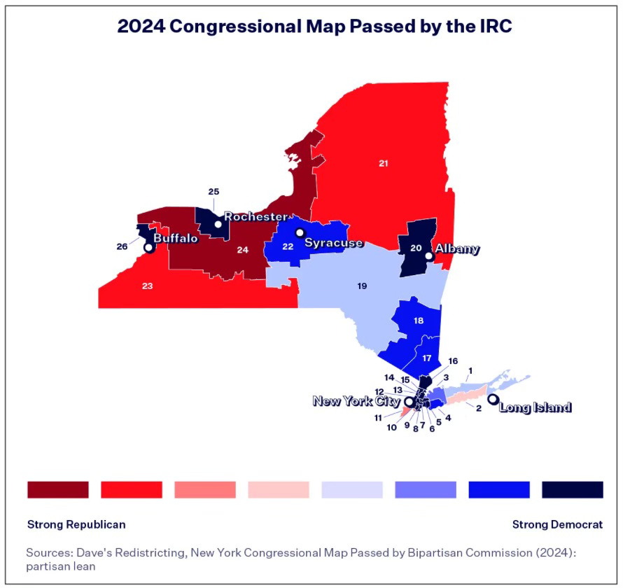
Confirmation biases affect most studies or chart choices but if one tries to be evidence rather than editorial based one can cut out a lot of non-evidence based nonsense. I mostly use NOMINATE to examine longitudinal ideological shifts, ideological positions of the congress, chambers, committees, caucuses, demographics, individual bill support and so on. I've used Cook PVI and NOMINATE data to topline D/R+20 districts (there are 94 in the 119th) in various ways.
Simple shapes and colors can be useful problem solving tools, especially during periods of decreased access to educational opportunity, a bellwether of polarization if ever there was one.
Cheers - good luck. I like what I see. :-) - Chip